LIXIN
Evolving a DJ Brand Through Systems Thinking
How real-world constraints shaped my DJ identity system over time
Role: Brand owner, director, and designer
Discipline: Identity Design, Naming Systems, Experience Design
Scope: Personal DJ identity system across multiple iterations

Me DJing at a Pre-Valentines Day event
Overview
This is a study in naming under constraint.
What started as a simple DJ alias gradually turned into an evolving identity system shaped by real-world friction, built directly from my own practice as a DJ. Each version came from breakdowns in usage, visibility, or resonance rather than from abstract exploration.
The progression from DJ Li to Li* and finally LIXIN is less a linear rebrand story and more a record of adjustments made while the identity was being tested in actual environments.
Working on it meant there was no distance between designer and subject. Every decision carried bias, familiarity, and hesitation, and that proximity shaped the outcome as much as any design logic.
Across the system, there is also a quieter thread. References to Chinese linguistic and philosophical ideas appear as a nod to my father’s roots and the culture I inherited from him.
The work covered naming, logo evolution, symbolic structure, typographic behavior, and applications across promotional and performance environments.
Starting Point: DJ Li
The first version came from something simple. People already called me Li, so DJ Li felt immediate and usable, without much deliberation.
The visual direction leaned into cybersigilism-inspired forms, drawing from internet symbolism and experimental typography. The mark was built from an abstraction of the Chinese character 燕 (which is my Chinese name when repeated), while also forming a combination type logo that read as DJ Li.

Can you spot how it reads “DJ Li”?
Over time, the thinness of “Li” became a limitation. In dense visual environments like flyers or stage compositions, the mark often disappeared rather than held presence. At that stage it was not yet a critical issue, since the identity had not been tested in performance conditions.
The use of “DJ” also started to feel redundant. It described the role rather than expanding the identity. DJ Li slowly shifted from being an identity to something closer to a label.
First Shift: Li*
Li* emerged from a need to simplify the name while removing the “DJ” prefix. On its own, “Li” felt too minimal. It did not carry enough weight for performance contexts or broader creative scope.
The asterisk was introduced as an extension point. A small symbol carrying the idea of everything not explicitly defined in the name. It functioned as a wildcard. Li, but not fixed.
In practice, it created friction. The character could not be used reliably across platforms, handles, or URLs. This led to the practical social media handle “li.sterisk”, used only as a readable workaround for platforms where Li* was not possible.
The logo also introduced an unintended issue. It very closely resembled the logo mark of Macbeth, which created unwanted association and forced a redesign.

This was the first moment the identity stopped behaving purely as a concept and started failing in structure and application.
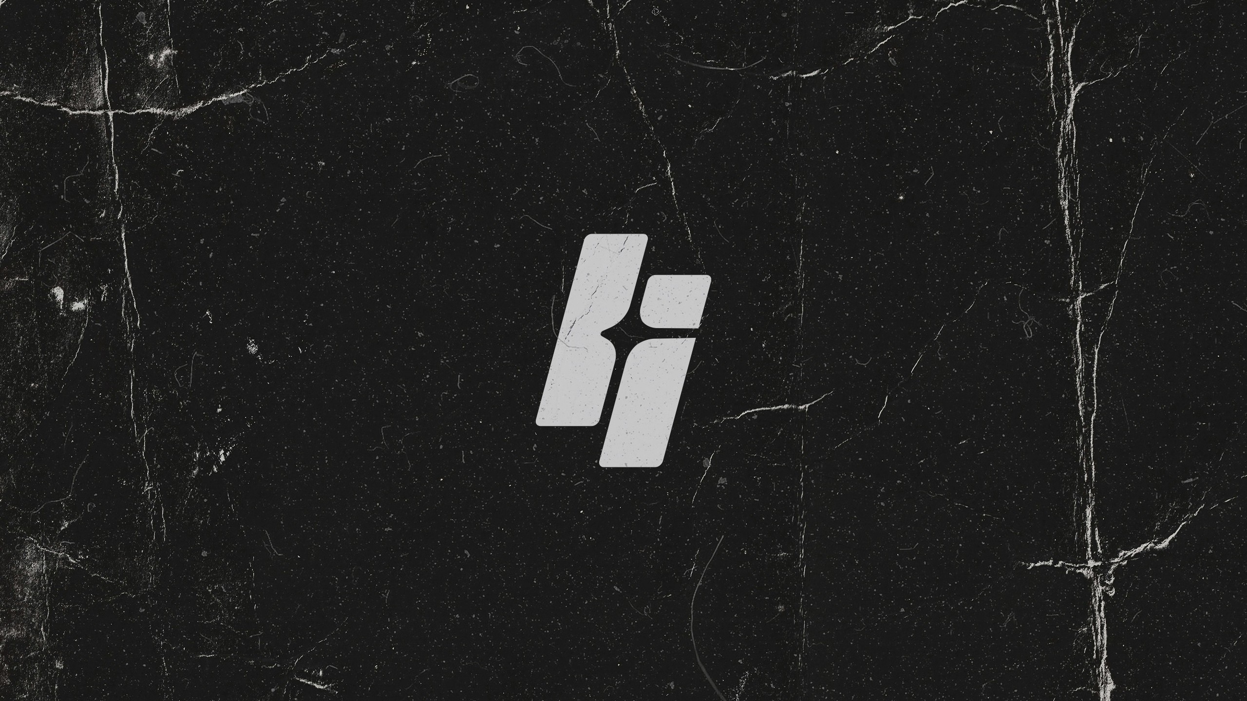
LIXIN
LIXIN emerged from a set of practical constraints rather than a conceptual leap.
“Li” was too difficult to search and too easily lost in digital space. Li*, while conceptually consistent, was unstable in speech and lacked a strong visual and phonetic center.
An intermediate direction, “Lixing,” combined Li with Xing (星), which means “star”, referencing the earlier asterisk. It carried the right idea but did not hold phonetically. In speech, it felt loose and unresolved.
Removing the final consonant created a tighter form. LIXIN felt more stable visually, more balanced in structure, and more consistent when spoken. In the logo system, the star placed between the L and I also began to read as a subtle heart form, echoing the meaning of “xin” (心), reinforcing the emotional core of the identity.
It also connected, in hindsight, to 立心 (lì xīn) from Zhang Zai’s teachings:
为天地立心,为生民立命,为往圣继绝学,为万世开太平
To ordain conscience for Heaven and Earth, to secure life and fortune for the people, to continue the lost teachings of past sages, and to establish peace for all future generations.
The idea of “立心” introduces a reading of establishing intent or inner principle. This connection was not the starting point of the name, but it became a meaningful layer once the form settled. In this reading, “为天地立心” translates into using music as an avenue to establish a heart between heaven and earth, where DJ sets become a form of alignment between internal intent and the space they are played into.
Structural Reading
LI represents origin and authorship. X carries the rupture, the unknown variable, and the residue of the original asterisk idea. IN points to internalization and immersion.
Together, the name compresses a shift in state rather than a fixed meaning.
recognition → disruption → absorption
Design Rationale
Across iterations, the same problems kept reappearing in different forms. LIXIN resolves them in a way that is operational rather than conceptual. It is more searchable than Li, more stable than Li*, and less procedural than li.sterisk.
Visually, it holds stronger balance and symmetry, especially in caps and motion contexts where earlier versions tended to collapse or fragment.
The identity now behaves less like a descriptive label and more like a system artifact that can exist across environments without needing explanation.
These decisions gave the identity a clearer system logic, which became most visible once it was applied across real-world touchpoints.
Outcomes
The final system resolved into a functional and expressive identity that could operate across real-world applications.
A cleaner, more structured logo mark emerged, with improved visual balance and clarity compared to earlier iterations. The L–star–I construction became more distinct at both small and large scales, supporting recognition across motion, stage visuals, and static applications.
The LIXIN name also introduced a more defined typographic silhouette. It became more legible in digital environments and more distinct in search contexts, addressing the earlier issue of the identity being difficult to locate or differentiate online.
The identity was applied across multiple touchpoints, including promotional materials, stickers, and DJ visual backdrops. This allowed the system to be tested in performance environments rather than remaining a static branding exercise.
The result is an identity that can move between design and performance contexts, with enough structure to hold presence and enough flexibility to adapt within live environments.
Closing Reflection

Each version was a response to friction observed in use rather than a pursuit of refinement for its own sake.
The work was not about finding a perfect name, but about removing the points where the identity broke under repetition, context, or scale.
LIXIN is where the system stopped trying to explain itself and started holding its own shape.